Google Teases a Redesign for Its Login Page
Google, the tech giant that has become synonymous with search, email, and productivity tools, is about to give its login page a fresh coat of digital paint. The company recently announced plans to revamp the sign-in experience for its suite of products and services, promising a more modern and minimalist aesthetic. So, what can users expect from this redesign, and how will it impact their daily interactions with Google services?
The Teaser
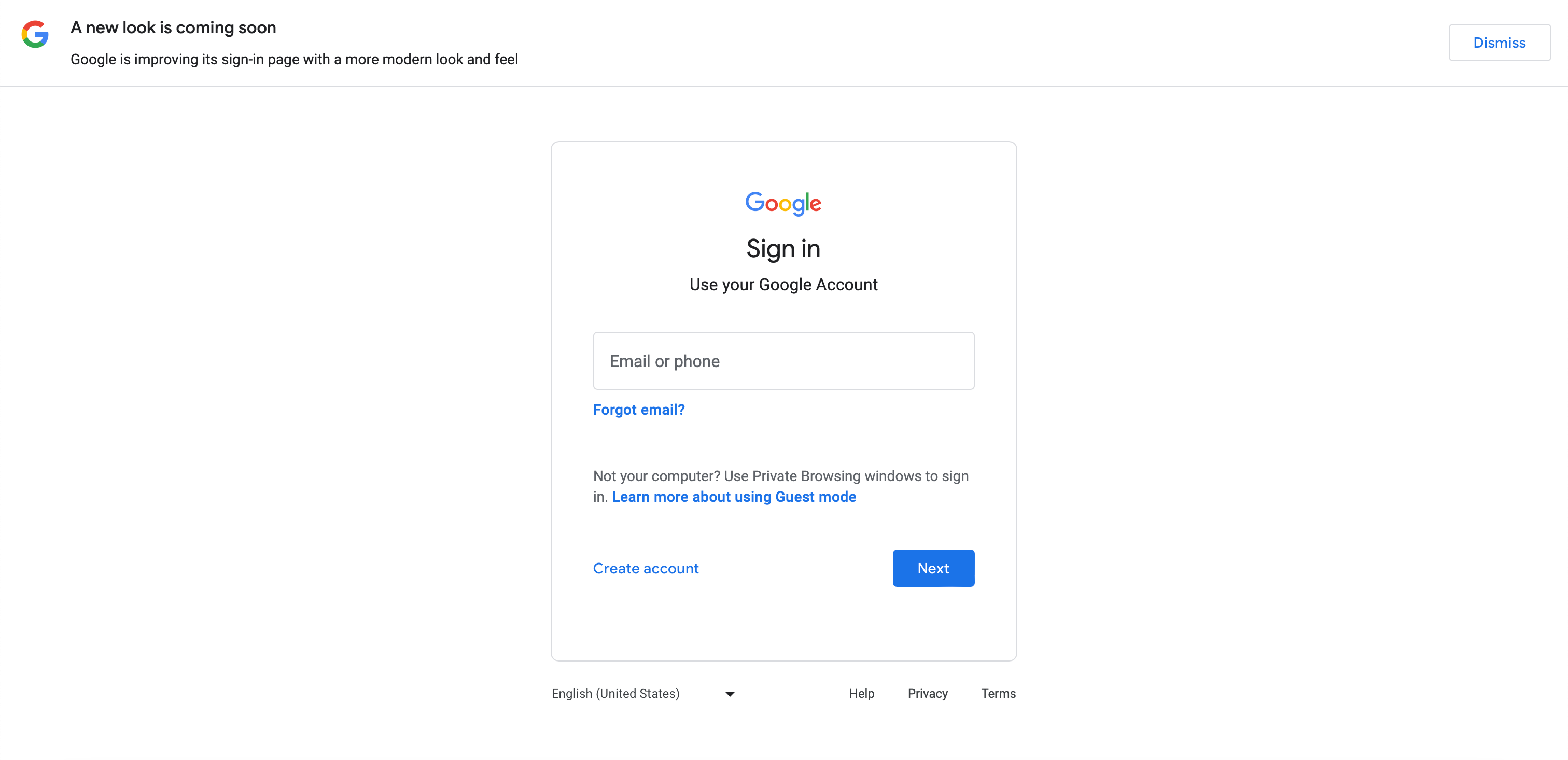
The upcoming changes were subtly hinted at with a banner across the top of many Google Account login screens. While the company has not provided an exact release date, the message simply states that the redesign will roll out “soon.” But what does “soon” mean in Google time? We’ll have to keep our eyes peeled for further announcements.
Material Design 3 Concepts
Google’s design language has evolved over the years, and the new login page will draw inspiration from Material Design 3. This design philosophy emphasizes simplicity, clarity, and consistency. Here are some key aspects of the upcoming makeover:
1. Clean and Streamlined Layout
The cluttered login page we’ve grown accustomed to will make way for a cleaner, more streamlined interface. Expect fewer distractions and a focus on essential elements like the sign-in form and security features.
2. Unified Look Across Devices
Google aims to create a consistent experience across platforms. Whether you’re signing in from your desktop, laptop, or mobile device, the visual elements will align seamlessly. This uniformity ensures that users feel at home, regardless of their preferred device.
3. Enhanced Security Prompts
Security is a top priority for Google. The redesigned login page will incorporate clearer security prompts, making it easier for users to verify their identity and take necessary precautions. Expect to see improved two-factor authentication (2FA) options and better guidance on password management.
4. Responsive and Accessible
The new design will adapt gracefully to different screen sizes. Whether you’re using a large monitor or a tiny smartphone, the login page will remain legible and user-friendly. Accessibility features will also receive attention, ensuring that everyone can navigate the sign-in process effortlessly.


Impact on Users
1. Familiarity with a Twist
While change can be unsettling, Google’s redesign aims to strike a balance between novelty and familiarity. Users will recognize the Google brand but appreciate the subtle improvements. After all, a fresh coat of paint doesn’t alter the essence of a house—it just makes it more inviting.
2. Efficiency and Speed
A streamlined login page means quicker access to Google services. Whether you’re checking your Gmail, accessing Google Drive, or collaborating on Docs, the redesigned interface will reduce friction and enhance efficiency.
3. Security Reinforcement
Google’s commitment to security extends beyond aesthetics. By providing clearer security prompts and encouraging robust authentication practices, the company aims to protect users’ accounts from unauthorized access.
4. Aesthetic Pleasure
Let’s face it: aesthetics matter. The new login page promises a visually pleasing experience. Whether you’re a casual user or a productivity enthusiast, interacting with Google will feel more delightful.
As Google prepares to unveil its revamped login page, users can anticipate a harmonious blend of form and function. The Material Design 3 concepts, combined with Google’s commitment to security, promise a login experience that’s both elegant and efficient. So, keep an eye out for that “soon” announcement—it might just redefine how you interact with the digital gateway to the Googleverse.
Disclaimer: The information provided in this article is based on announcements and teasers available as of the publication date. Actual features and implementation may vary.
Share This Story


latest for you
Now loading...
news via inbox
Always stay updated with latest trends. Leave your email here!
In case you missed!


Recommended For You
Now loading...